Powering up! Descriptive Statistics and Inferential Tests
Descriptive and inferential statistics form the bedrock of any complex analysis. Descriptive statistics summarize raw data and provide a snapshot of the sample’s features, revealing trends, patterns, and distributions, essential for making the data comprehensible. Inferential statistics allow for conclusions or predictions about a larger population from the sampled data, providing the necessary basis for hypothesis testing. Together, they provide an initial understanding of data, and an informed context for the application of more complex statistical or machine learning techniques.
As we mentioned in the Introduction- there are many ways to skin a cat in R.
tidyverse() for Describing data
As we learned yesterday- the tidyverse has revolutionised data wranggling and can be extended likewise into the realm of descriptive statistics. Creating tables with dplyr functions summarise() and count() is a useful approach to calculating summary statistics, summarize by group, or pass tables to ggplot() or flextable(). In yesterdays tutorial we briefly did visit this, but we will extend on this in the next 10 minutes or so before transitioning into a simpler more efficient way of describing data in R.
Just to be consistent we what I said yesterday- before diving into the data always always skim the data first to get a quick feels
c19_df %>%
  skimr::skim()
Data summary
Name
Piped data
Number of rows
37152
Number of columns
15
_______________________
Column type frequency:
character
10
numeric
5
________________________
Group variables
None
Variable type: character
skim_variable
n_missing
complete_rate
min
max
empty
n_unique
whitespace
date
0
1
10
10
0
1004
0
date_announced
0
1
10
10
0
1000
0
date_positive
0
1
10
10
0
999
0
date_dose1
0
1
0
10
22437
298
0
date_dose2
0
1
0
10
28034
267
0
date_dose3
0
1
0
10
35719
161
0
brand1
0
1
0
16
22437
8
0
brand2
0
1
0
16
28034
7
0
brand3
0
1
0
16
35719
6
0
state
0
1
5
17
0
16
0
Variable type: numeric
skim_variable
n_missing
complete_rate
mean
sd
p0
p25
p50
p75
p100
hist
age
0
1
62.65
16.59
0
51
64
75
130
▁▃▇▃▁
male
0
1
0.58
0.49
0
0
1
1
1
▆▁▁▁▇
bid
0
1
0.21
0.41
0
0
0
0
1
▇▁▁▁▂
malaysian
0
1
0.89
0.31
0
1
1
1
1
▁▁▁▁▇
comorb
0
1
0.79
0.41
0
1
1
1
1
▂▁▁▁▇
Get counts
The most simple function to apply within summarise() is n(). Leave the parentheses empty to count the number of rows. You may have seen this being used several times yesterday. Let
c19_df %>%# begin with linelistsummarise(n_rows =n()) # return new summary dataframe with column n_rows
  n_rows
1  37152
Lets try and stratify that by nationality and BID status:
c19_df %>%group_by(malaysian, bid) %>%# group data by unique values in column age_catsummarise(n_rows =n()) # return number of rows *per group*
`summarise()` has grouped output by 'malaysian'. You can override using the
`.groups` argument.
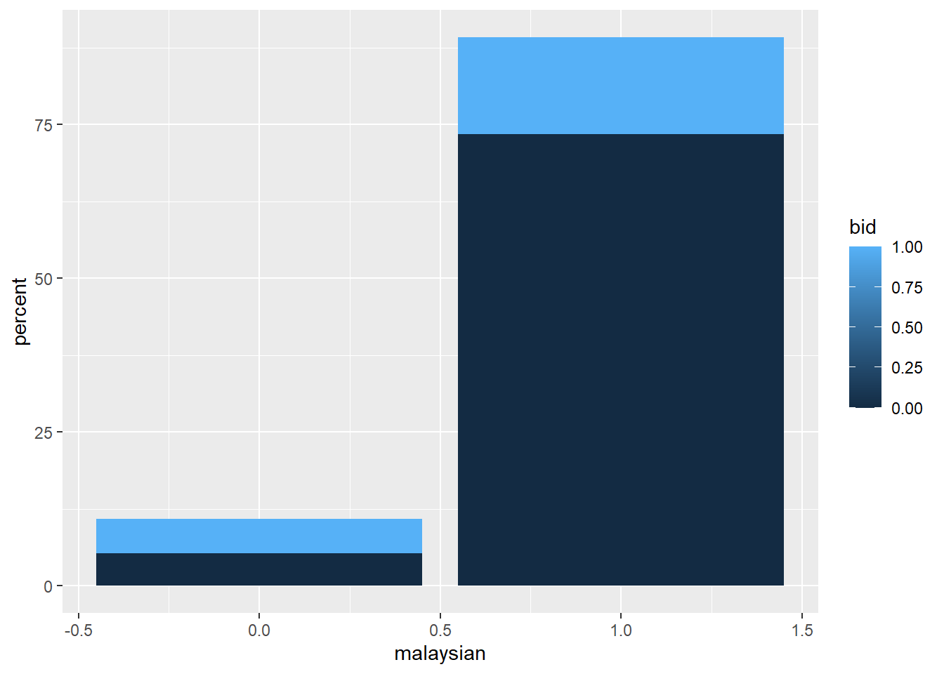
Proportions can be added by piping the table to mutate() to create a new column. Define the new column as the counts column (n by default) divided by the sum() of the counts column (this will return a proportion).
bid_summary <- c19_df %>%count(malaysian, bid) %>%# group and count by gender (produces "n" column)mutate( # create percent of column - note the denominatorpercent =round((n /sum(n))*100,2)) # printbid_summary
Using these structure we can very easily modify these summary statistics using ggplot() or html tables kable() or presentation ready tables using flextable() (flextable is not covered in this course but you can check it out here). An example of a plot is as follows:
c19_df %>%count(malaysian, bid) %>%mutate(percent =round((n /sum(n))*100,2)) %>%ggplot()+# pass new data frame to ggplotgeom_col( # create bar plotmapping =aes( x = malaysian, # map outcome to x-axisfill = bid, # map age_cat to the filly = percent)) # map the counts column `n` to the height
Or a nice little table summary:
c19_df %>%count(malaysian, bid) %>%mutate(malaysian =factor(malaysian,levels=c("0","1"),labels=c("non-Malaysian", "Malaysian")),bid =factor(bid,levels=c("0","1"),labels=c("Hospital", "BID")),) %>%mutate(percent =round((n /sum(n))*100,2))%>% knitr::kable(format="html", caption ="COVID-19 fatalities by Nationality and Place of Death",) %>% kableExtra::kable_minimal()
COVID-19 fatalities by Nationality and Place of Death
malaysian
bid
n
percent
non-Malaysian
Hospital
1958
5.27
non-Malaysian
BID
2076
5.59
Malaysian
Hospital
27288
73.45
Malaysian
BID
5830
15.69
Summary statistics
One major advantage of dplyr and summarise() is the ability to return more advanced statistical summaries like median(), mean(), max(), min(), sd() (standard deviation), and percentiles. You can also use sum() to return the number of rows that meet certain logical criteria. As above, these outputs can be produced for the whole data frame set, or by group.
The syntax is the same - within the summarise() parentheses you provide the names of each new summary column followed by an equals sign and a statistical function to apply. Within the statistical function, give the column(s) to be operated on and any relevant arguments (e.g. na.rm = TRUE for most mathematical functions).
You can also use sum() to return the number of rows that meet a logical criteria. The expression within is counted if it evaluates to TRUE. For example:
sum(age_years < 18, na.rm=T)
sum(gender == "male", na.rm=T)
sum(response %in% c("Likely", "Very Likely"))
Below, c19_df data are summarised to describe the days delay from death to announcement (column days_death_state), by state.
c19_df %>%# begin with linelist, save out as new objectgroup_by(state) %>%# group all calculations by hospitalmutate(across(contains("date"), ~as.Date(., format ="%Y-%m-%d")), #change character to dates\ fromatdays_death_state=date_announced-date) %>%# calculate the delay for each deathsummarise( # only the below summary columns will be returneddeaths =n(), # number of rows per groupdelay_max =max(days_death_state, na.rm = T), # max delaydelay_mean =round(mean(days_death_state, na.rm=T), digits =1), # mean delay, roundeddelay_sd =round(sd(days_death_state, na.rm = T), digits =1), # standard deviation of delays, roundeddelay_3 =sum(days_death_state >=3, na.rm = T), # number of rows with delay of 3 or more dayspct_delay_3 = scales::percent(delay_3 / deaths) # convert previously-defined delay column to percent (scales gives the % sign behind) )
# A tibble: 16 × 7
   state             deaths delay_max delay_mean delay_sd delay_3 pct_delay_3
   <chr>              <int> <drtn>    <drtn>        <dbl>   <int> <chr>
 1 Johor               4740 253 days   4.8 days      11.8    1987 42%
 2 Kedah               2756 338 days  10.0 days      18.6    1531 56%
 3 Kelantan            1428 153 days   7.5 days      12.5     920 64%
 4 Melaka              1213 386 days   5.2 days      15       460 38%
 5 Negeri Sembilan     1546 274 days   8.7 days      19.5     659 43%
 6 Pahang              1037 325 days   5.2 days      19       392 38%
 7 Perak               2164 178 days   4.0 days       9.4    1029 48%
 8 Perlis               199  16 days   2.5 days       2.4      67 34%
 9 Pulau Pinang        2085 396 days   3.7 days      10.9     958 46%
10 Sabah               3211 237 days   4.9 days       8.7    2062 64%
11 Sarawak             1795 167 days   4.5 days       9.6     900 50%
12 Selangor           11024 370 days  17.5 days      23.5    8688 79%
13 Terengganu           905 150 days   3.2 days       7       421 47%
14 W.P. Kuala Lumpur   2861 315 days  11.0 days      21.3    2026 71%
15 W.P. Labuan          159  14 days   1.3 days       1.3      13 8%
16 W.P. Putrajaya        29 388 days  20.9 days      71.6      14 48%
Tip
Use sum() with a logic statement to “count” rows that meet certain criteria (==)
Note the use of na.rm = TRUE within mathematical functions like sum(), otherwise NA will be returned if there are any missing values
Use the function percent() from the scales package to easily convert to percents
Set accuracy = to 0.1 or 0.01 to ensure 1 or 2 decimal places respectively
To calculate these statistics on the entire dataset, use summarise() without group_by()
You may create columns for the purposes of later calculations (e.g. denominators) that you eventually drop from your data frame with select().
Conditional statistics
You may want to return conditional statistics - e.g. the maximum of rows that meet certain criteria. This can be done by subsetting the column with brackets [ ].
# A tibble: 16 × 3
   state             max_age_msian max_age_non_msian
   <chr>                     <dbl>             <dbl>
 1 Johor                      64                45
 2 Kedah                      65                45
 3 Kelantan                   68                58
 4 Melaka                     64                42.5
 5 Negeri Sembilan            67                45
 6 Pahang                     65                46
 7 Perak                      70                46
 8 Perlis                     71                44
 9 Pulau Pinang               70                45
10 Sabah                      69                59
11 Sarawak                    71                42
12 Selangor                   63                47
13 Terengganu                 67.5              50
14 W.P. Kuala Lumpur          66                47
15 W.P. Labuan                61                56
16 W.P. Putrajaya             68                NA
Percentiles
Percentiles and quantiles in dplyr deserve a special mention. To return quantiles, use quantile() with the defaults or specify the value(s) you would like with probs =.
# get default percentile values of age (0%, 25%, 50%, 75%, 100%)c19_df %>%summarise(age_percentiles =quantile(age, na.rm =TRUE))
Warning: Returning more (or less) than 1 row per `summarise()` group was deprecated in
dplyr 1.1.0.
ℹ Please use `reframe()` instead.
ℹ When switching from `summarise()` to `reframe()`, remember that `reframe()`
  always returns an ungrouped data frame and adjust accordingly.
  age_percentiles
1               0
2              51
3              64
4              75
5             130
Or manually defined percentiles that are grouped
# get manually-specified percentile values of age (5%, 50%, 75%, 98%)c19_df %>%group_by(malaysian) %>%summarise(age_percentiles =quantile( age,probs =c(.05, 0.5, 0.75, 0.98), na.rm=TRUE) )
Warning: Returning more (or less) than 1 row per `summarise()` group was deprecated in
dplyr 1.1.0.
ℹ Please use `reframe()` instead.
ℹ When switching from `summarise()` to `reframe()`, remember that `reframe()`
  always returns an ungrouped data frame and adjust accordingly.
`summarise()` has grouped output by 'malaysian'. You can override using the
`.groups` argument.
Do keep in mind that there any many ways to skin the cat! And always there will be more efficient ways to do things as you progress through R- Here is an example from the rstatix package
c19_df %>%group_by(malaysian) %>% rstatix::get_summary_stats(age, type ="quantile")
# A tibble: 2 × 8
  malaysian variable     n  `0%` `25%` `50%` `75%` `100%`
      <int> <fct>    <dbl> <dbl> <dbl> <dbl> <dbl>  <dbl>
1         0 age       4034     0    41    48    56    130
2         1 age      33118     0    54    66    76    110
across() multiple columns
You can use summarise() across multiple columns using across(). This makes life easier when you want to calculate the same statistics for many columns. Place across() within summarise() and specify the following:
.cols = as either a vector of column names c() or “tidyselect” helper functions (explained below)
.fns = the function to perform (no parentheses) - you can provide multiple within a list()
c19_df %>%group_by(state) %>%mutate(across(contains("date"), ~as.Date(., format ="%Y-%m-%d")), #change character to dates\ fromatdays_toAnnounce_state=date_announced-date,day_toDeath_state=date-date_positive) %>%summarise(across(.cols =c(day_toDeath_state, days_toAnnounce_state), # columns.fns =list("mean"= mean, "sd"= sd), # multiple functions na.rm=T)) # extra arguments
Warning: There was 1 warning in `summarise()`.
ℹ In argument: `across(...)`.
ℹ In group 1: `state = "Johor"`.
Caused by warning:
! The `...` argument of `across()` is deprecated as of dplyr 1.1.0.
Supply arguments directly to `.fns` through an anonymous function instead.

  # Previously
  across(a:b, mean, na.rm = TRUE)

  # Now
  across(a:b, \(x) mean(x, na.rm = TRUE))
# A tibble: 16 × 5
state day_toDeath_state_mean day_toDeath_state_sd days_toAnnounce_stat…¹
<chr> <drtn> <dbl> <drtn>
1 Johor 5.563924 days 9.17 4.796414 days
2 Kedah 6.058418 days 6.43 9.989115 days
3 Kelantan 5.427871 days 6.74 7.468487 days
4 Melaka 7.693322 days 9.28 5.209398 days
5 Negeri Se… 6.683700 days 6.99 8.657827 days
6 Pahang 7.459016 days 13.1 5.176471 days
7 Perak 4.489372 days 7.60 3.978281 days
8 Perlis 6.015075 days 10.0 2.457286 days
9 Pulau Pin… 4.852278 days 4.75 3.738129 days
10 Sabah 5.930551 days 15.8 4.892245 days
11 Sarawak 5.973816 days 9.05 4.523120 days
12 Selangor 7.434960 days 12.1 17.509434 days
13 Terengganu 5.896133 days 6.78 3.240884 days
14 W.P. Kual… 6.166375 days 12.1 11.021671 days
15 W.P. Labu… 6.232704 days 6.47 1.314465 days
16 W.P. Putr… 7.862069 days 7.29 20.896552 days
# ℹ abbreviated name: ¹days_toAnnounce_state_mean
# ℹ 1 more variable: days_toAnnounce_state_sd <dbl>
Here are those “tidyselect” helper functions you can provide to .cols = to select columns:
Descriptives statistics approaches in R are numerous.
I initially heavily utilised dplyr and the janitor (you can find a tutorial here) and tableone (you can find a tutorial here) packages which are both fantastic packages. More recently however, I discovered gtsummary. And lets just say its the bomb! Its my absolutely favourite package for descriptive analysis (and we will explore some of its other powerful extensions later).
If you want to print your summary statistics in a pretty, publication-ready graphic, you can use the gtsummary package and its function tbl_summary(). The code can seem complex at first, but the outputs look very nice and print to your RStudio Viewer panel as an HTML image. s
Summary table
The default behavior of tbl_summary() is quite incredible - it takes the columns you provide and creates a summary table in one command. The function prints statistics appropriate to the column class: median and inter-quartile range (IQR) for numeric columns, and counts (%) for categorical columns. Missing values are converted to “Unknown”. Footnotes are added to the bottom to explain the statistics, while the total N is shown at the top.
c19_df %>%select(age, state, male, malaysian, bid) %>%# keep only the columns of interesttbl_summary() # default
Characteristic
N = 37,1521
age
64 (51, 75)
state
Johor
4,740 (13%)
Kedah
2,756 (7.4%)
Kelantan
1,428 (3.8%)
Melaka
1,213 (3.3%)
Negeri Sembilan
1,546 (4.2%)
Pahang
1,037 (2.8%)
Perak
2,164 (5.8%)
Perlis
199 (0.5%)
Pulau Pinang
2,085 (5.6%)
Sabah
3,211 (8.6%)
Sarawak
1,795 (4.8%)
Selangor
11,024 (30%)
Terengganu
905 (2.4%)
W.P. Kuala Lumpur
2,861 (7.7%)
W.P. Labuan
159 (0.4%)
W.P. Putrajaya
29 (<0.1%)
male
21,369 (58%)
malaysian
33,118 (89%)
bid
7,906 (21%)
1 Median (IQR); n (%)
Adjustments
by =
You can stratify your table by a column (e.g. by outcome), creating a 2-way table.
statistic =
Use an equations to specify which statistics to show and how to display them. There are two sides to the equation, separated by a tilde ~. On the right side, in quotes, is the statistical display desired, and on the left are the columns to which that display will apply.
c19_df %>%select(age) %>%# keep only columns of interest tbl_summary( # create summary tablestatistic = age ~"{mean} ({sd})") # print mean of age
Characteristic
N = 37,1521
age
63 (17)
1 Mean (SD)
digits =
Adjust the digits and rounding. Optionally, this can be specified to be for continuous columns only (as below).
label =
Adjust how the column name should be displayed. Provide the column name and its desired label separated by a tilde. The default is the column name.
missing_text =
Adjust how missing values are displayed. The default is “Unknown”.
type =
This is used to adjust how many levels of the statistics are shown. The syntax is similar to statistic = in that you provide an equation with columns on the left and a value on the right. Two common scenarios include:
type = all_categorical() ~ "categorical" Forces dichotomous columns (e.g. fever yes/no) to show all levels instead of only the “yes” row
type = all_continuous() ~ "continuous2" Allows multi-line statistics per variable, as shown in a later section
c19_df %>%mutate(across(contains("date"), ~as.Date(., format ="%Y-%m-%d")), #change character to dates\ fromatdays_delay=date_announced-date,days_admitted=date-date_positive,vaccinated=ifelse(is.na(date_dose2), "unvaccinated", "vaccinated")) %>%select(age, male, malaysian, bid, vaccinated, comorb, days_delay, days_admitted) %>%# keep only columns of interesttbl_summary( by = malaysian, # stratify entire table by outcomestatistic =list(all_continuous() ~"{mean} ({sd})", # stats and format for continuous columnsall_categorical() ~"{n} / {N} ({p}%)"), # stats and format for categorical columnsdigits =all_continuous() ~1, # rounding for continuous columnstype =all_categorical() ~"categorical", # force all categorical levels to displaylabel =list( # display labels for column names malaysian ~"Nationality", age ~"Age (years)", male ~"Gender", bid ~"Brought-in-dead", comorb ~"Comorbids", vaccinated ~"Vaccine status", days_admitted ~"Duration between diagnosis and death (days) ", days_delay ~"Duration between death and announcement (days)"),missing_text ="NA"# how missing values should display )
Characteristic
0, N = 4,0341
1, N = 33,1181
Age (years)
49.5 (14.3)
64.3 (16.1)
Gender
0
1,649 / 4,034 (41%)
14,134 / 33,118 (43%)
1
2,385 / 4,034 (59%)
18,984 / 33,118 (57%)
Brought-in-dead
0
1,958 / 4,034 (49%)
27,288 / 33,118 (82%)
1
2,076 / 4,034 (51%)
5,830 / 33,118 (18%)
Vaccine status
unvaccinated
3,808 / 4,034 (94%)
24,226 / 33,118 (73%)
vaccinated
226 / 4,034 (5.6%)
8,892 / 33,118 (27%)
Comorbids
0
2,175 / 4,034 (54%)
5,717 / 33,118 (17%)
1
1,859 / 4,034 (46%)
27,401 / 33,118 (83%)
Duration between death and announcement (days)
15.0 (19.4)
8.9 (18.2)
Duration between diagnosis and death (days)
4.1 (14.6)
6.6 (10.0)
1 Mean (SD); n / N (%)
Multi-line stats for continuous variables
If you want to print multiple lines of statistics for continuous variables, you can indicate this by setting the type = to “continuous2”. You can combine all of the previously shown elements in one table by choosing which statistics you want to show. To do this you need to tell the function that you want to get a table back by entering the type as “continuous2”. The number of missing values is shown as “Unknown”.
c19_df %>%mutate(across(contains("date"), ~as.Date(., format ="%Y-%m-%d")), #change character to dates\ fromatdays_delay=date_announced-date,days_admitted=date-date_positive) %>%select(age, days_delay, days_admitted) %>%# keep only columns of interesttbl_summary( # create summary tabletype =all_continuous() ~"continuous2", # indicate that you want to print multiple statistics statistic =all_continuous() ~c("{mean} ({sd})", # line 1: mean and SD"{median} ({p25}, {p75})", # line 2: median and IQR"{min}, {max}") # line 3: min and max )
Characteristic
N = 37,152
age
Mean (SD)
63 (17)
Median (IQR)
64 (51, 75)
Range
0, 130
days_delay
Mean (SD)
10 (18)
Median (IQR)
3 (2, 7)
Range
0, 396
days_admitted
Mean (SD)
6 (11)
Median (IQR)
4 (0, 9)
Range
0, 724
rstatix() for inferential statistics
Inferential statistics is a set of statistical procedures that allows us to draw conclusions about an entire population from a representative sample. The importance of inferential statistics lies in its ability to:
Generalize about a population: Inferential statistics enables researchers to make predictions or inferences about a population based on the observations made in a sample.
Test hypotheses: With inferential statistics, researchers can test a hypothesis to determine its statistical significance.
Study relationships: It allows researchers to examine the relationships between different variables in a sample and to generalize these relationships to the broader population.
We will not focus on the mathematics behind inferential statistics but more so the impementation within R. Nontheless, here is a quick summary of commonly used inferential statistical tests and when they are used:
T-tests (One-sample, Independent Two-sample, and Paired): These are used when we want to compare the means of one or two groups. For example, comparing the average height of men and women.
Analysis of Variance (ANOVA): ANOVA is used when comparing the means of more than two groups. For example, comparing the average income of people in three different cities.
Chi-square test: The chi-square test is used to determine if there is a significant association between two categorical variables. For example, examining the relationship between gender and voting behavior.
Correlation and Regression: Correlation is used to measure the strength and direction of the linear relationship between two variables. Regression is used to predict the value of one variable based on the value of another.
Each test has assumptions that need to be satisfied for the results to be accurate, so it’s essential to choose the right test for the data and research question at hand.
While it is possible to run these tests in base() R, we will skip that in this course since our grounding has all been carried out within the tidyverse(). If you wish to study inferential statistics using base () R you can have a look at this.
For the purposes of this course we shall take a deeper look at the rstatix package:
T-test
Use a formula syntax to specify the numeric and categorical columns for a two sample t-test:
# A tibble: 1 × 7
  .y.   group1 group2         n statistic    df         p
* <chr> <chr>  <chr>      <int>     <dbl> <dbl>     <dbl>
1 age   1      null model 37152      30.8 37151 2.73e-206
Or one sample t-tests by group
c19_df %>%group_by(male) %>%t_test(age ~1, mu =60)
# A tibble: 2 × 8
   male .y.   group1 group2         n statistic    df         p
* <int> <chr> <chr>  <chr>      <int>     <dbl> <dbl>     <dbl>
1     0 age   1      null model 15783      26.0 15782 2.3 e-146
2     1 age   1      null model 21369      18.0 21368 6.59e- 72
Shapiro-Wilk test
Note: Sample size must be between 3-5000
c19_df %>%head(500) %>%# first 500 rows of case linelist, for example onlyshapiro_test(age)
# A tibble: 1 × 3
  variable statistic             p
  <chr>        <dbl>         <dbl>
1 age          0.967 0.00000000413
Wilcoxon rank sum test
c19_df %>%wilcox_test(age ~ malaysian)
# A tibble: 1 × 7
  .y.   group1 group2    n1    n2 statistic     p
* <chr> <chr>  <chr>  <int> <int>     <dbl> <dbl>
1 age   0      1       4034 33118 31201584.     0
Kruskal-Wallis test
Also known as the Mann-Whitney U test.
c19_df %>%kruskal_test(age ~ state)
# A tibble: 1 × 6
  .y.       n statistic    df         p method
* <chr> <int>     <dbl> <int>     <dbl> <chr>
1 age   37152     1367.    15 2.03e-282 Kruskal-Wallis
Chi-squared test
The chi-square test function accepts a table, so first we create a cross-tabulation. There are many ways to create a cross-tabulation but here we use tabyl() from janitor and remove the left-most column of value labels before passing to chisq_test().
# A tibble: 1 × 6
      n statistic     p    df method          p.signif
* <dbl>     <dbl> <dbl> <int> <chr>           <chr>
1 37152     2459.     0     1 Chi-square test ****
gtsummary() package for Inferential statistics
Use gtsummary if you are looking to add the results of a statistical test to a pretty table that was created with this package. Performing statistical tests of comparison with tbl_summary is done by adding the add_p function to a table and specifying which test to use. It is possible to get p-values corrected for multiple testing by using the add_q function. Run ?tbl_summary for details.
T-tests
Compare the difference in means for a continuous variable in two groups. For example, compare the mean age by patient outcome.
c19_df %>%select(age, malaysian) %>%# keep variables of interesttbl_summary( # produce summary tablestatistic = age ~"{mean} ({sd})", # specify what statistics to showby = malaysian) %>%# specify the grouping variableadd_p(age ~"t.test") # specify what tests to perform
Characteristic
0, N = 4,0341
1, N = 33,1181
p-value2
age
49 (14)
64 (16)
<0.001
1 Mean (SD)
2 Welch Two Sample t-test
Wilcoxon rank sum test
Compare the distribution of a continuous variable in two groups. The default is to use the Wilcoxon rank sum test and the median (IQR) when comparing two groups. However for non-normally distributed data or comparing multiple groups, the Kruskal-wallis test is more appropriate.
c19_df %>%select(age, malaysian) %>%# keep variables of interesttbl_summary( # produce summary tablestatistic = age ~"{median} ({p25}, {p75})", # specify what statistic to show (this is default so could remove)by = malaysian) %>%# specify the grouping variableadd_p(age ~"wilcox.test") # specify what test to perform (default so could leave brackets empty)
Characteristic
0, N = 4,0341
1, N = 33,1181
p-value2
age
48 (41, 56)
66 (54, 76)
<0.001
1 Median (IQR)
2 Wilcoxon rank sum test
Kruskal-wallis test
Compare the distribution of a continuous variable in two or more groups, regardless of whether the data is normally distributed.
c19_df %>%select(age, state) %>%# keep variables of interesttbl_summary( # produce summary tablestatistic = age ~"{median} ({p25}, {p75})", # specify what statistic to show (default, so could remove)by = state) %>%# specify the grouping variableadd_p(age ~"kruskal.test") # specify what test to perform
Characteristic
Johor, N = 4,7401
Kedah, N = 2,7561
Kelantan, N = 1,4281
Melaka, N = 1,2131
Negeri Sembilan, N = 1,5461
Pahang, N = 1,0371
Perak, N = 2,1641
Perlis, N = 1991
Pulau Pinang, N = 2,0851
Sabah, N = 3,2111
Sarawak, N = 1,7951
Selangor, N = 11,0241
Terengganu, N = 9051
W.P. Kuala Lumpur, N = 2,8611
W.P. Labuan, N = 1591
W.P. Putrajaya, N = 291
p-value2
age
62 (49, 73)
64 (52, 76)
68 (58, 77)
64 (50, 75)
66 (55, 76)
64 (53, 75)
70 (58, 79)
71 (60, 81)
69 (55, 79)
67 (56, 78)
71 (59, 79)
60 (48, 71)
67 (57, 77)
63 (50, 74)
60 (48, 72)
68 (60, 73)
<0.001
1 Median (IQR)
2 Kruskal-Wallis rank sum test
Chi-squared test
Compare the proportions of a categorical variable in two groups. The default statistical test for add_p() when applied to a categorical variable is to perform a chi-squared test of independence with continuity correction, but if any expected call count is below 5 then a Fisher’s exact test is used.
c19_df %>%select(malaysian, bid) %>%# keep variables of interesttbl_summary(by = bid) %>%# produce summary table and specify grouping variableadd_p() # specify what test to perform
Characteristic
0, N = 29,2461
1, N = 7,9061
p-value2
malaysian
27,288 (93%)
5,830 (74%)
<0.001
1 n (%)
2 Pearson's Chi-squared test
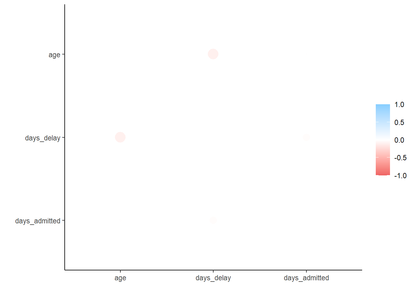
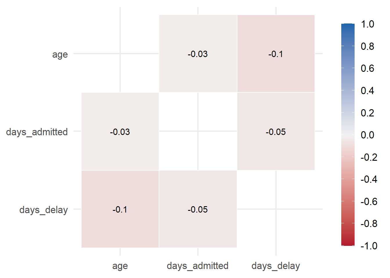
Correlations in R
Correlation between numeric variables can be investigated using the tidyverse corrr package. It allows you to compute correlations using Pearson, Kendall tau or Spearman rho. The package creates a table and also has a function to automatically plot the values.
correlation_tab <- c19_df %>%mutate(across(contains("date"), ~as.Date(., format ="%Y-%m-%d")), #change character to dates\ fromatdays_delay=as.numeric(date_announced-date),days_admitted=as.numeric(date-date_positive)) %>%select(age, days_delay, days_admitted) %>%# keep only columns of interestcorrelate() # create correlation table (using default pearson)
# A tibble: 3 × 4
  term              age days_delay days_admitted
  <chr>           <dbl>      <dbl>         <dbl>
1 age           NA         -0.0998       -0.0307
2 days_delay    -0.0998    NA            -0.0531
3 days_admitted -0.0307    -0.0531       NA
Plot a scatteplot of correlations
## plot correlations
rplot(correlation_tab)
Finally you can create a nifty little heatmap. You can calculate a correlation data frame using the correlate() function from corrr, reshape it into a long format with melt(), and then create a heatmap with ggplot2: